The Challenge
Revocare Solutions, an emerging name in the Business Process Outsourcing (BPO) sector, approached Das Design Studio with a high-stakes request: to completely revamp their visual identity into something bold, modern, and instantly trustworthy. Their previous branding lacked memorability and failed to convey the level of professionalism and innovation they represented. What they needed was a refined identity that would hold its own across digital platforms, print collateral, merchandise, and internal materials — all while staying true to their core values. They specifically requested the use of blue and green, colors that symbolized growth, dependability, and a forward-looking mindset in the tech-driven world of outsourcing.
The Approach
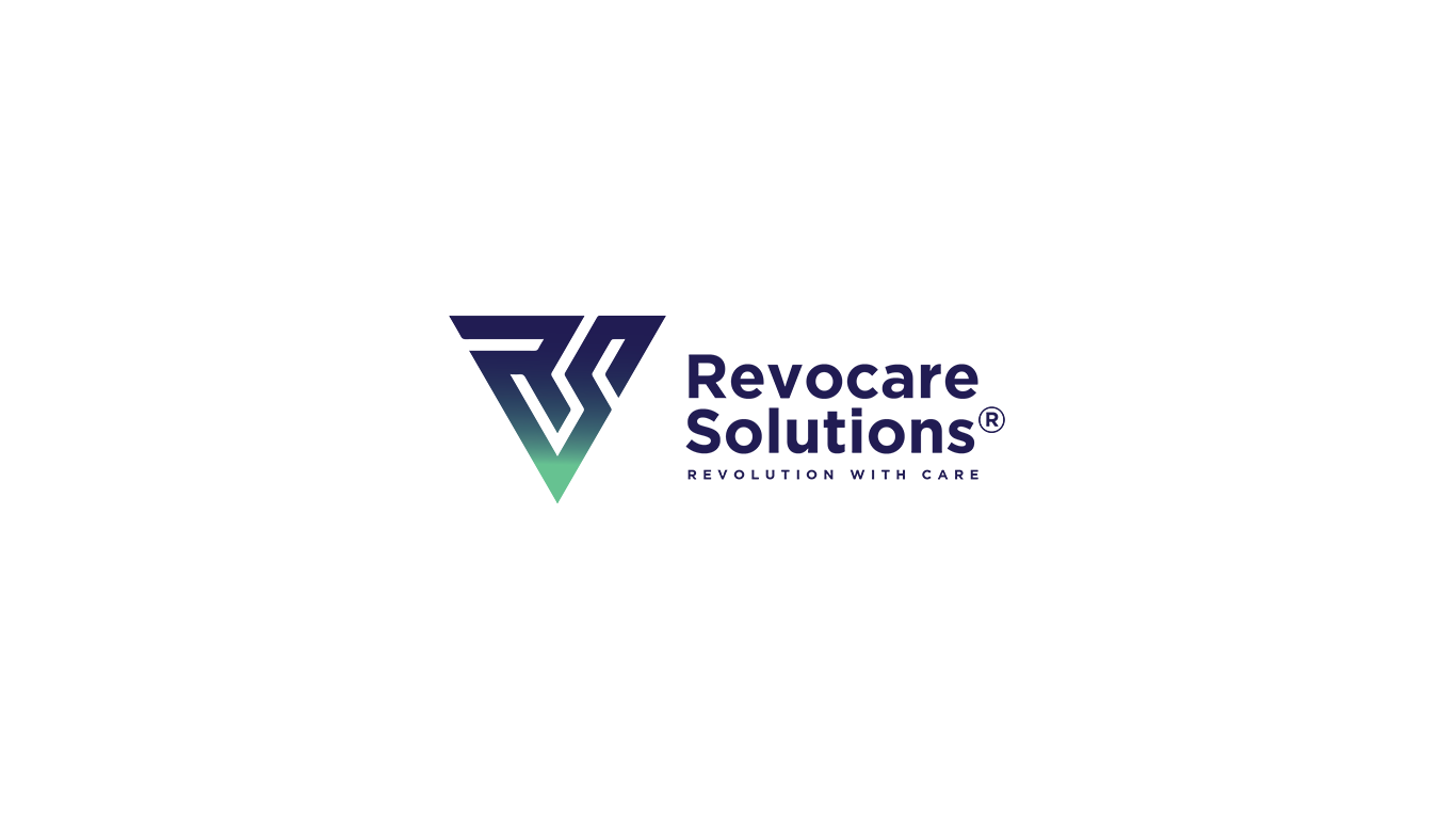
We began by immersing ourselves in the BPO industry, focusing on the emotional expectations of their clients — what they look for, what they fear, and what builds trust. This led us to uncover the key pillars of the Revocare brand: clarity, adaptability, and operational excellence. With those values guiding the design, we conceptualized a logo that merges the initials “R” and “S” into a single, balanced geometric form. The result was a logo that felt strong, minimal, and distinctly modern — one that could scale seamlessly from digital interfaces to branded merchandise. The color palette, a strategic blend of green and blue, was applied to communicate both innovation and reliability without saying a word.
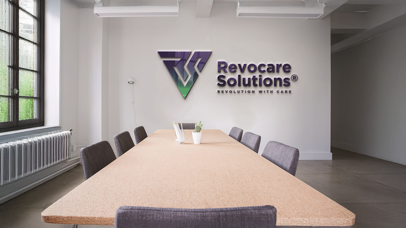
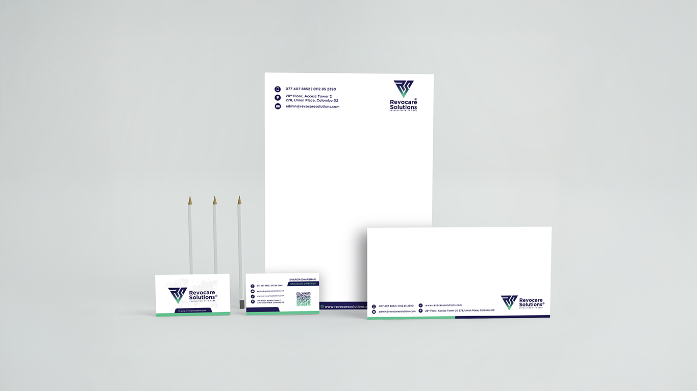
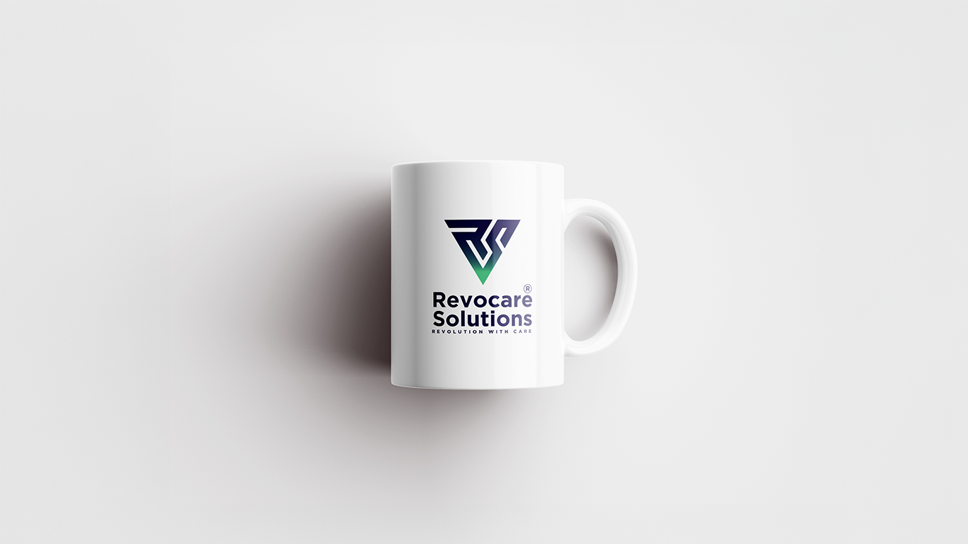
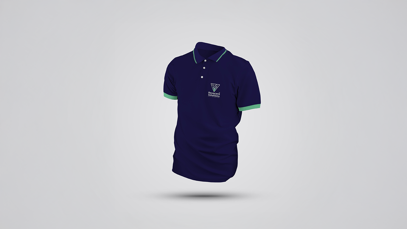
But the transformation didn’t end with the logo. We rolled out a full suite of brand collateral including business stationery, internal documents, employee ID cards, and merchandise such as mugs and branded t-shirts for both team use and corporate gifting. Every design decision, from typography and spacing to alignment and visual rhythm, was made with consistency and clarity in mind. The entire visual system was built to feel cohesive across all applications while elevating the brand’s image at every touchpoint.
The Outcome
The final result was a sleek, professional, and technology-forward identity that repositioned Revocare Solutions as a credible and competitive player in the BPO space. The new branding was quickly implemented across their digital ecosystem and physical assets, providing an immediate lift in brand recognition and overall aesthetic cohesion. Internally, the response was equally positive — employees felt more connected to the company’s mission and proud to represent the updated brand. The consistent design language across all touchpoints helped create a unified experience that resonated with clients, partners, and team members alike.
This project highlights Das Design Studio’s ability to take a brand from visual confusion to visual clarity — aligning design with purpose to create branding that doesn’t just look good, but works hard.