The Challenge
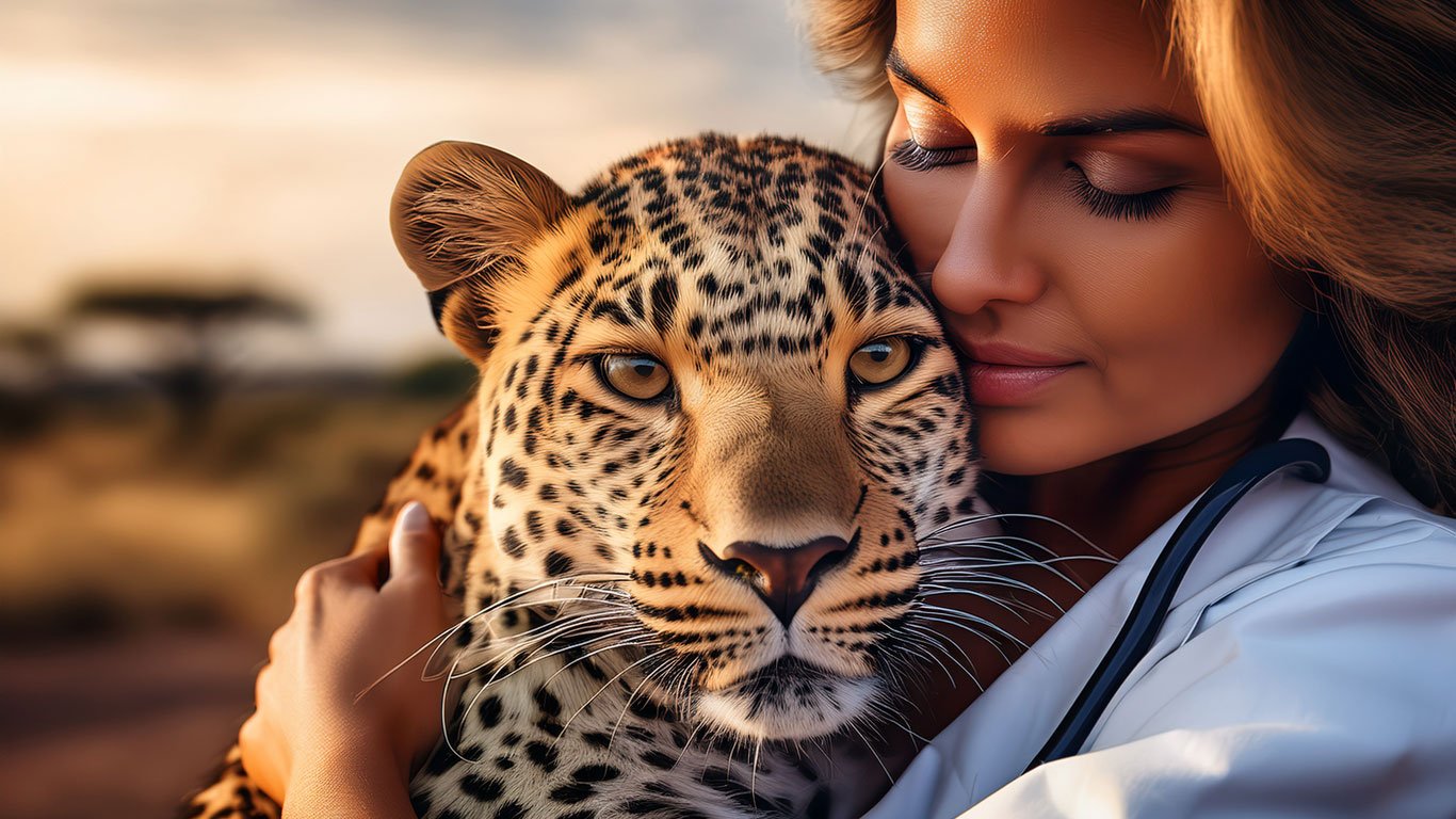
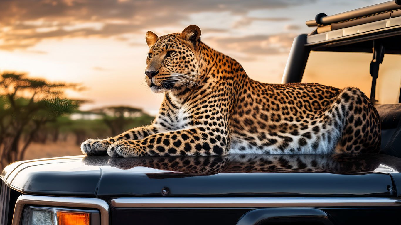
When Dr. Emily Hawthorne, a renowned veterinary doctor and the visionary founder of Leopard Safari in Botswana’s Moremi Game Reserve, reached out to us, she needed a logo that would reflect the raw and majestic nature of the African leopard. The challenge was to design a visual identity that was both minimal and bold, something that could be easily recognized across diverse mediums like safari jeeps, staff uniforms, and brand merchandise. The design had to balance simplicity with a wild aesthetic—something that would resonate with wildlife lovers and stand out in the competitive safari tourism space.
The Approach
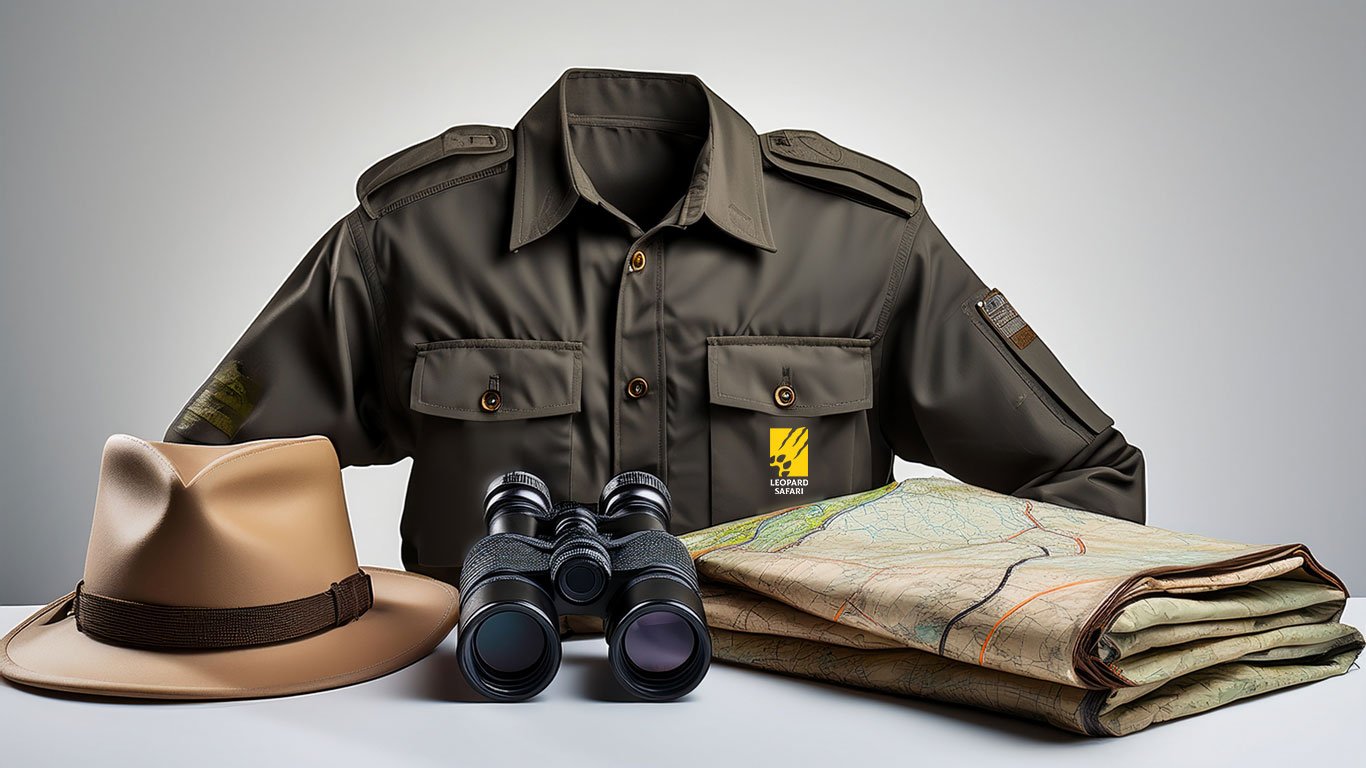
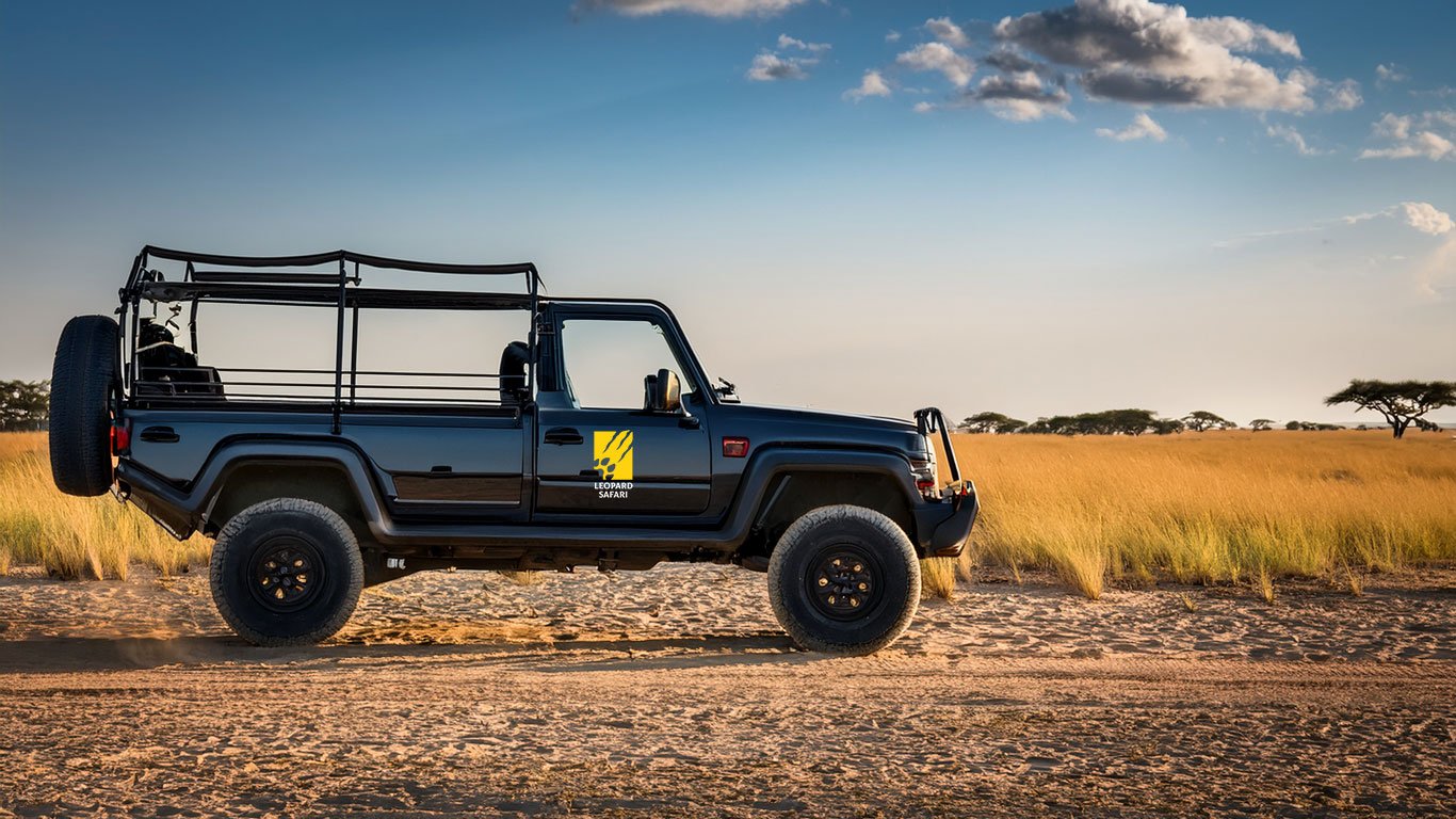
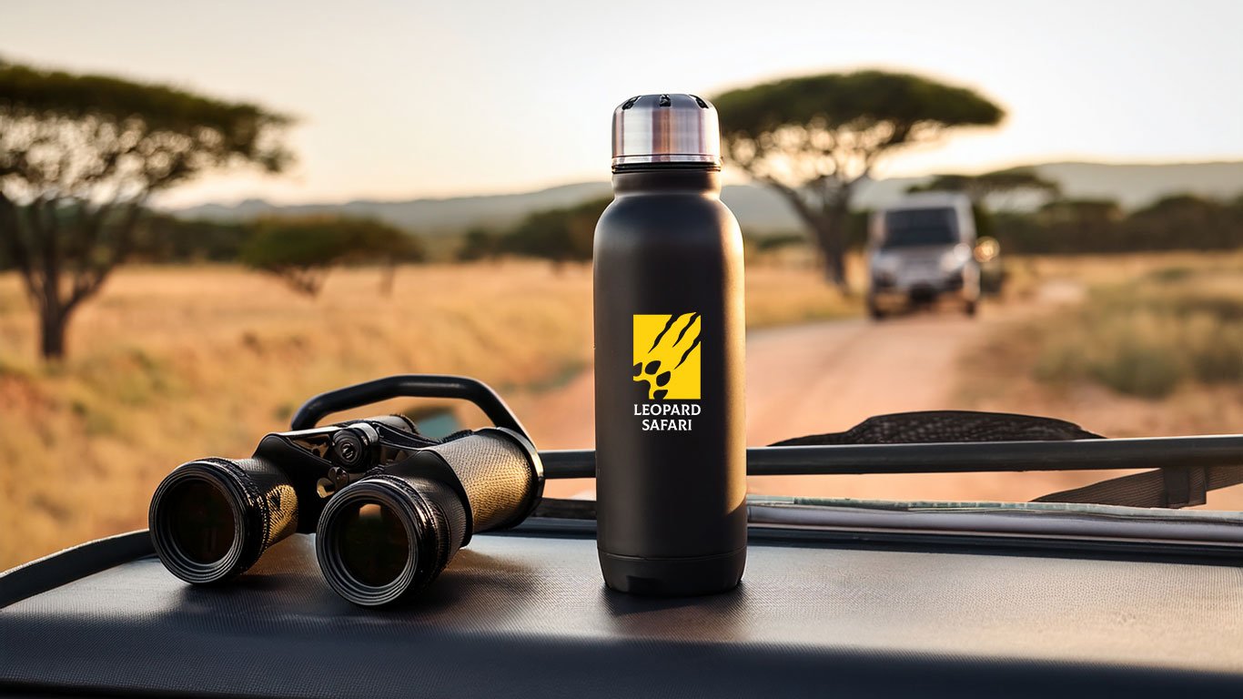
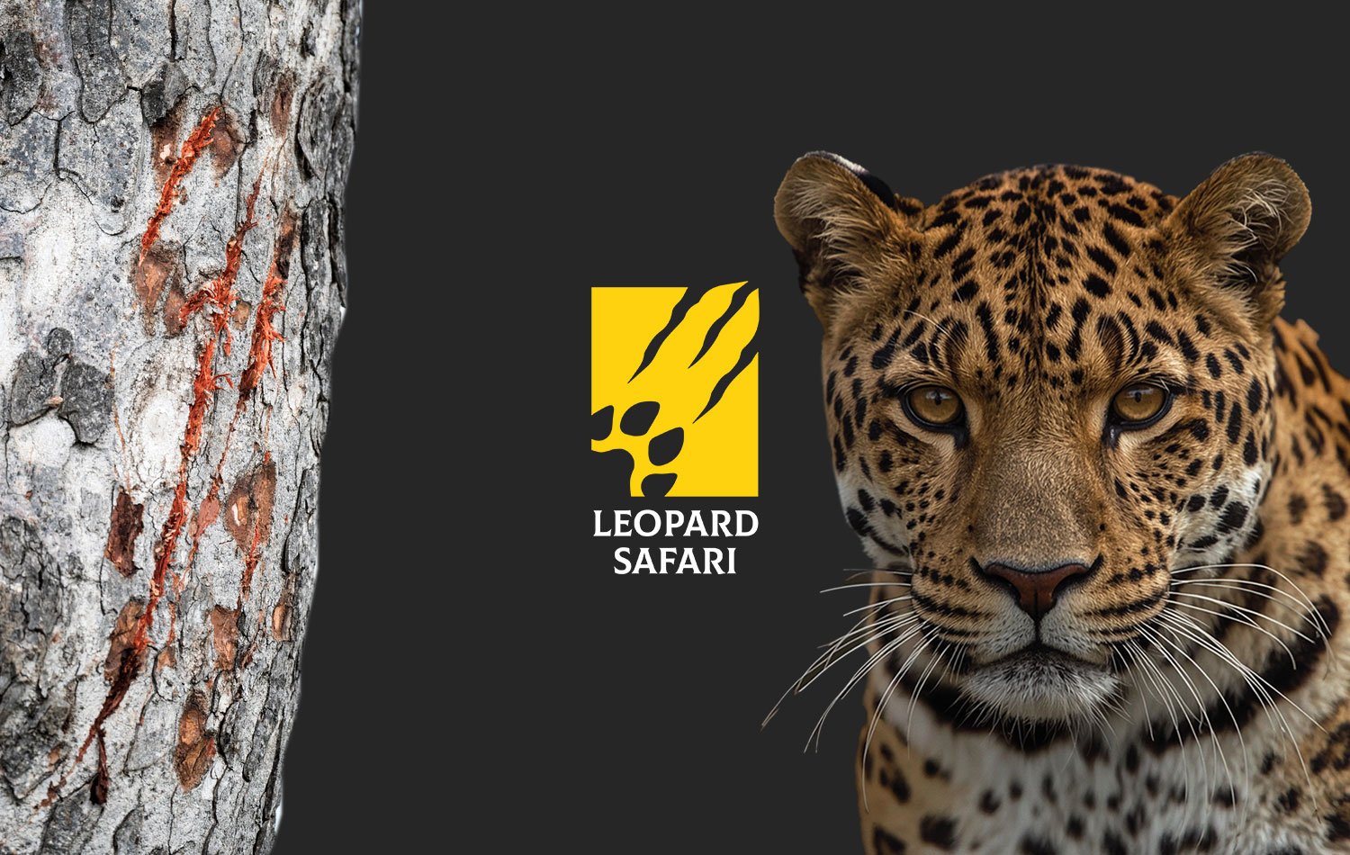
To create a logo that truly represents the Leopard Safari experience, we dove deep into the environment, culture, and symbolism of African safaris. We focused on blending iconic natural elements with a clean design language. A stylized leopard footprint was merged with sharp claw scratch marks, emphasizing both the elegance and the fierce nature of the leopard. The color palette—vibrant yellow on a black background—was strategically chosen for maximum visibility in the African bush while ensuring strong brand recognition. Close collaboration with Dr. Emily allowed us to fine-tune every aspect of the design, ensuring it remained versatile, scalable, and aligned with her vision. From concept to completion, we prioritized adaptability for every brand touchpoint.
The Outcome
The final result was a striking and cohesive logo that now proudly defines the Leopard Safari brand. It has become a bold visual signature across safari vehicles, uniforms, and promotional materials throughout the Moremi Game Reserve. Dr. Emily commended our team for the creative direction, attention to detail, and on-time delivery. The logo has elevated their brand presence, making it instantly recognizable to tourists and wildlife enthusiasts around the globe. Today, Leopard Safari enjoys increased visibility, deeper emotional connection with visitors, and a strong foothold in Botswana’s adventure tourism industry—all powered by a timeless logo that roars with character.