The Challenge
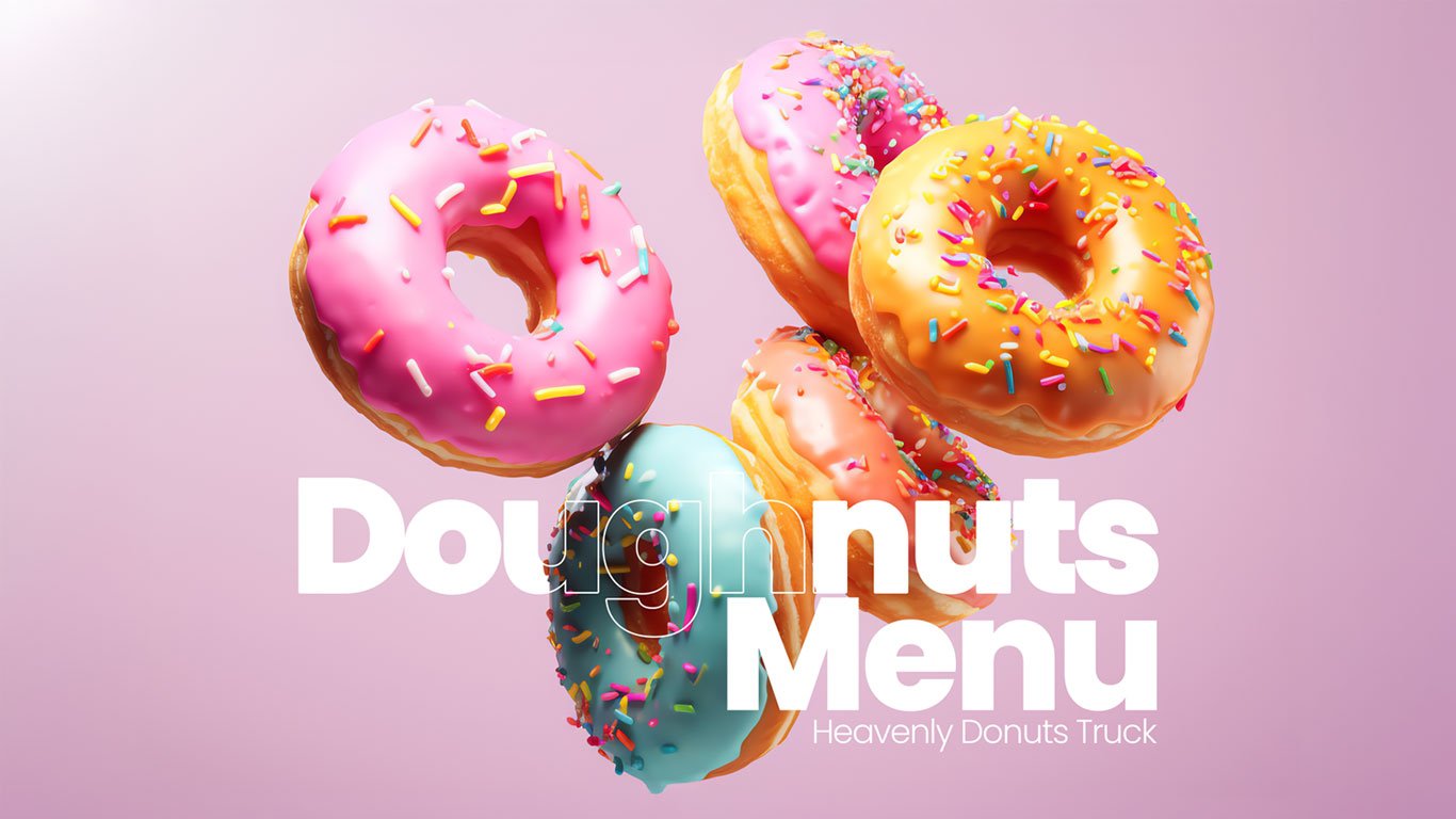
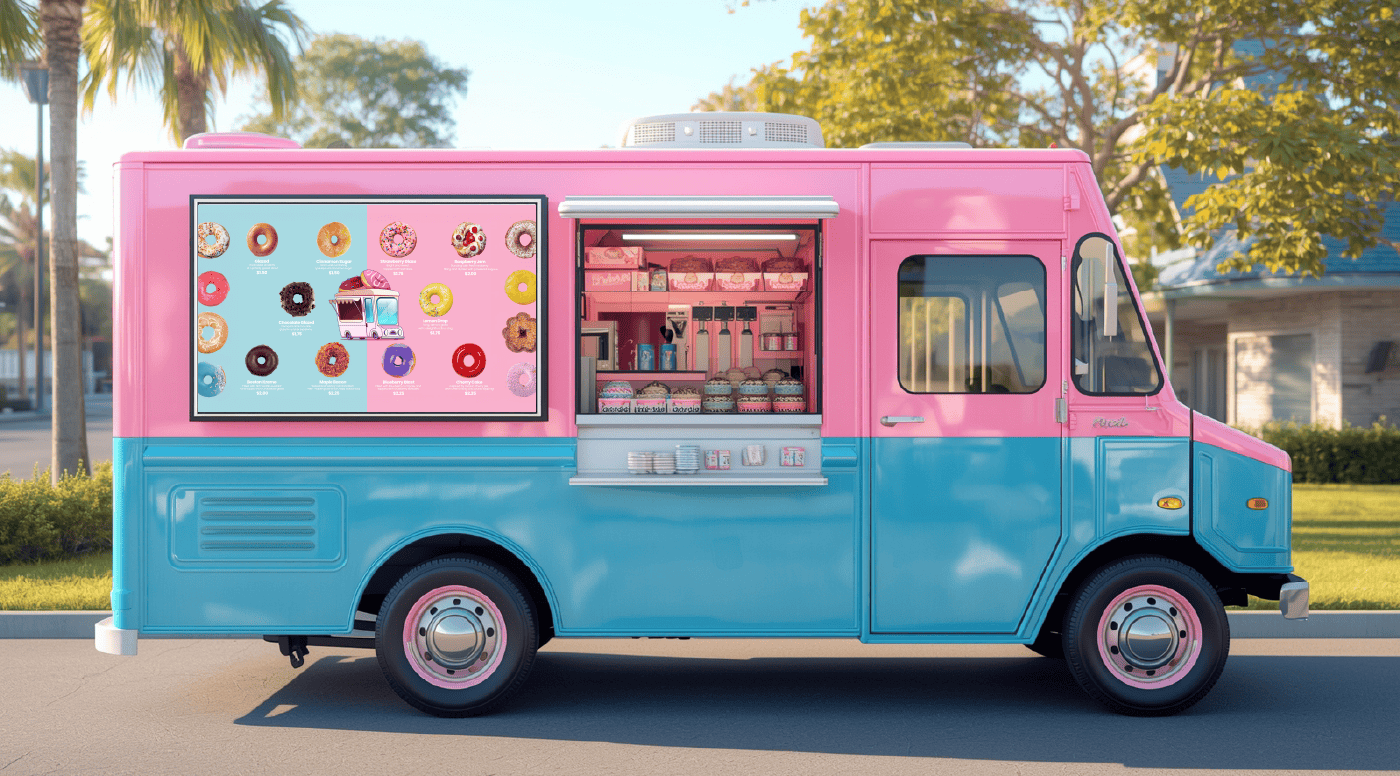
At Das Design Studio, we designed a mouthwatering doughnuts truck menu for Heavenly Doughnuts Truck, a beloved mobile vendor in the U.S. The goal was to create a clean, vibrant, and TV-display-friendly menu that would turn passing customers into loyal buyers.
This project blends real product imagery, bold typography, and a perfectly balanced layout to make ordering as tempting as biting into a freshly glazed doughnut. 🍩
Food trucks rely on quick customer decisions. In a fast-moving environment, the Menu Design can make or break a sale. The client needed a Doughnuts Truck Menu that:
-
Stands out in crowded outdoor spaces.
-
Is easy to read at a distance.
-
Showcases real products, not stock images.
-
Works flawlessly on both TV screens and printed flyers.
Their previous menu lacked impact and visibility. We set out to fix that with a strategic design approach focused on clarity, cravings, and conversion.
The Approach
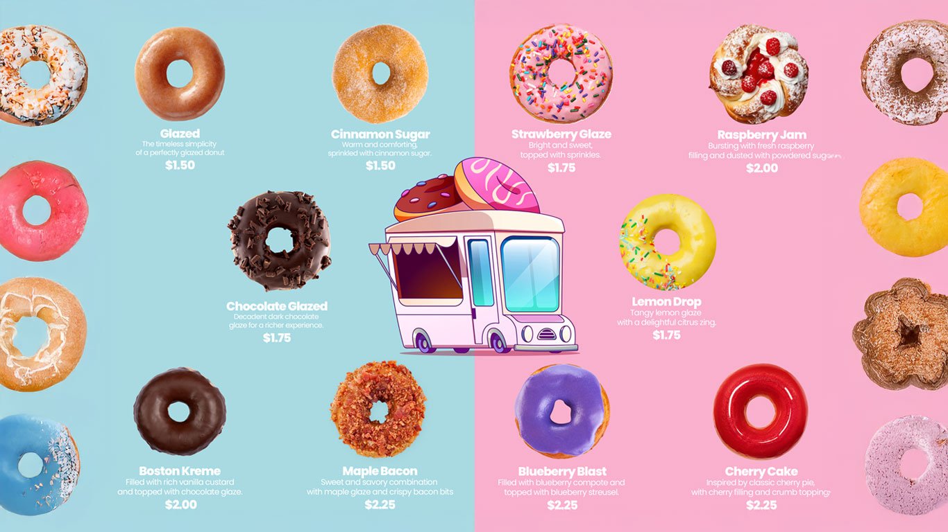
We began by analyzing their brand colors — a playful mix of pastel pinks, creamy blues, and frosting tones that reflect the sweet, welcoming vibe of their doughnut truck. Instead of using generic graphics, the client shared high-resolution product photos of their actual doughnuts.
“People don’t eat clipart. They want to see the real deal.” 🍩
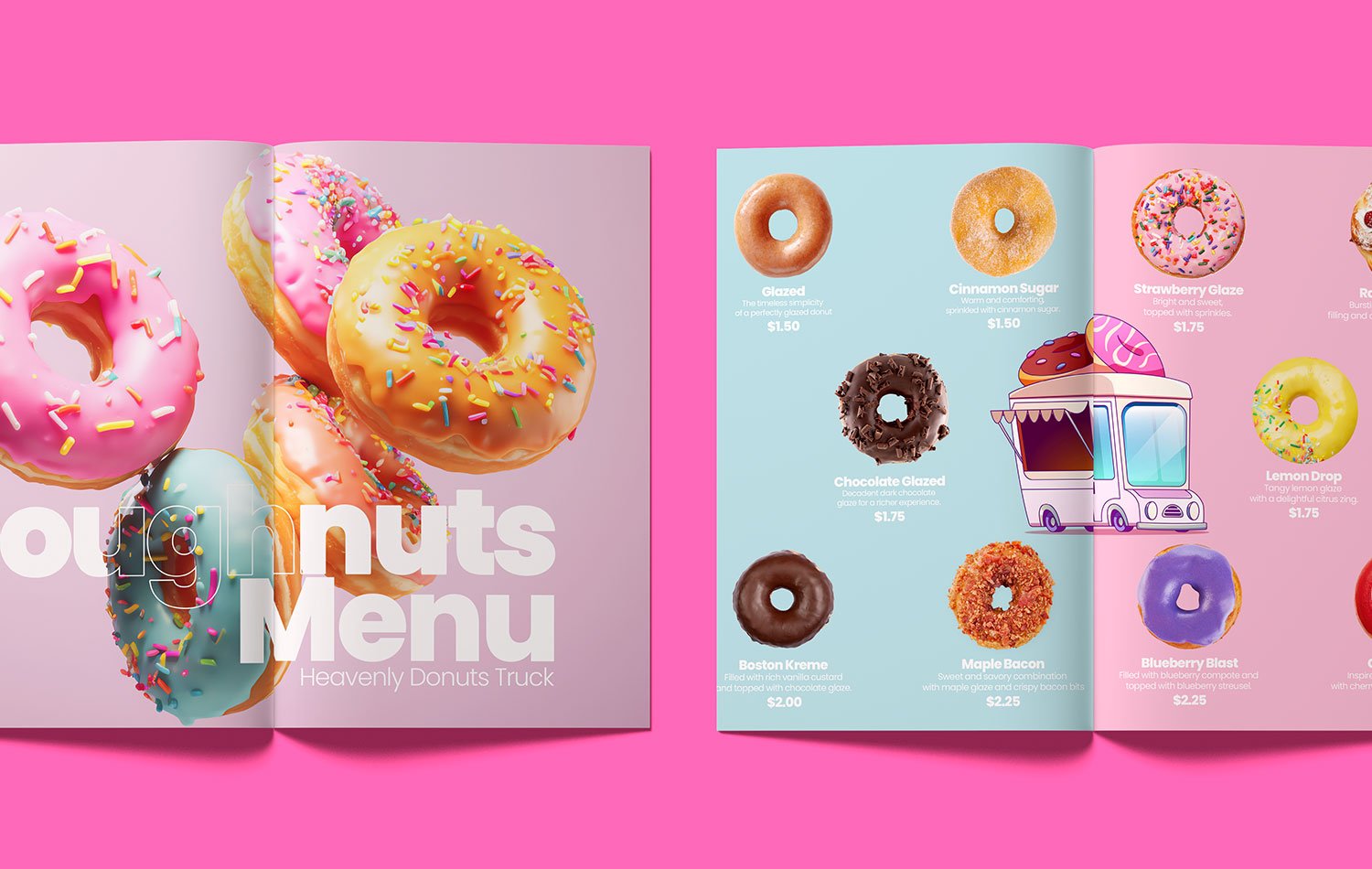
Our design team removed backgrounds from each image, making every doughnut stand out in crisp detail. A symmetrical grid layout was created to keep pricing and product names clear whether viewed on a 4K TV or a handheld flyer.
The two-tone background added rhythm and flow, guiding the eyes naturally across each delicious flavour. We paired this with bold, modern typography to ensure high readability and a contemporary look.
All final files were exported in TV display and print-ready formats, giving the client flexibility to use the design across their trucks, flyers, and digital screens.
The Outcome
The final doughnuts truck menu was a showstopper. Crisp, realistic product photos made customers crave before they ordered.
-
The TV version looked bright even in sunlight.
-
The print version worked perfectly for flyers and signage.
-
The layout was clear, clutter-free, and sales-driven.
The client proudly called it “the best menu we’ve ever had” and rolled it out across their full fleet of food trucks.
This menu design didn’t just look good — it increased visibility, improved the ordering experience, and boosted sales. Real images built trust, while the clean structure made ordering effortless.
Check out more of Our Menu and Packaging Design work to see how we help food brands stand out.
Want to learn more about the history of doughnuts? Visit Wikipedia.