Mango Mania — Logo Design Sri Lanka Studio Takes on a Family Legacy Brand
Great logo design tells a story before a single word is read. This project is one of the most meaningful briefs our logo design Sri Lanka studio has taken on. It was a deep creative journey rooted in family, heritage, and purpose.
Mango Mania is a mango juice export brand built on a family legacy. Three brothers inherited their father’s mango farm in Indonesia. Together, they turned it into a premium, no-sugar-added juice brand targeting European markets. Coming to us ready to build something special, the brief started with the logo. Later, the product label followed.
The Brief That Came to Our Logo Design Studio in Sri Lanka
The client needed more than just a good-looking logo. Specifically, they needed a brand identity that told their story. The brand had to feel premium and minimal. At the same time, it had to carry warmth and family values beneath the surface.
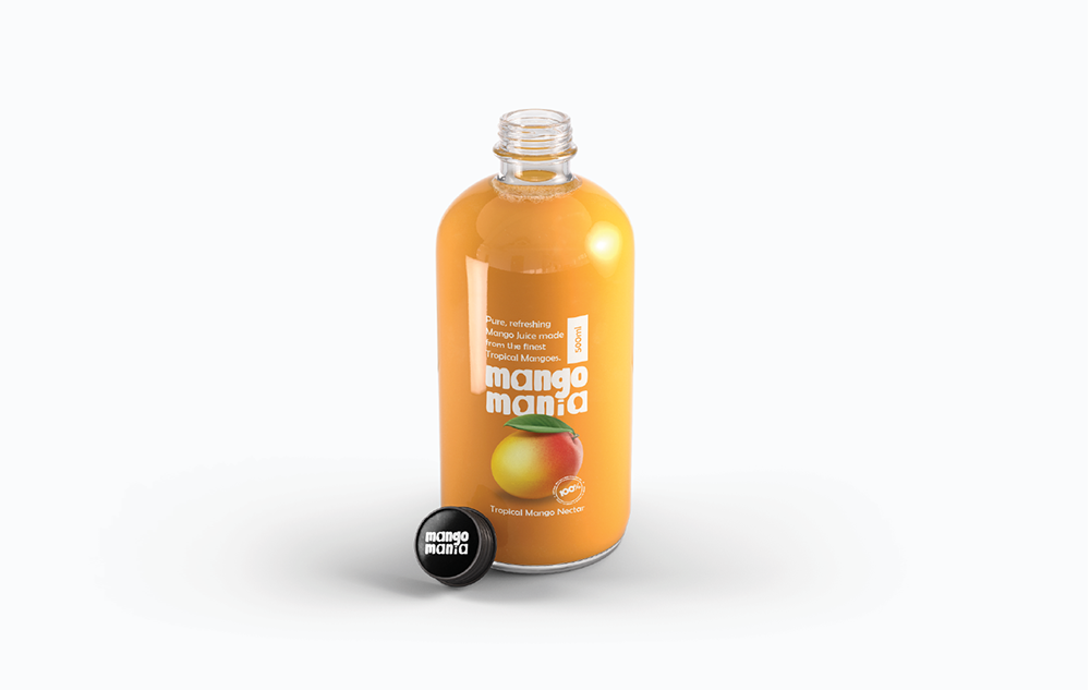
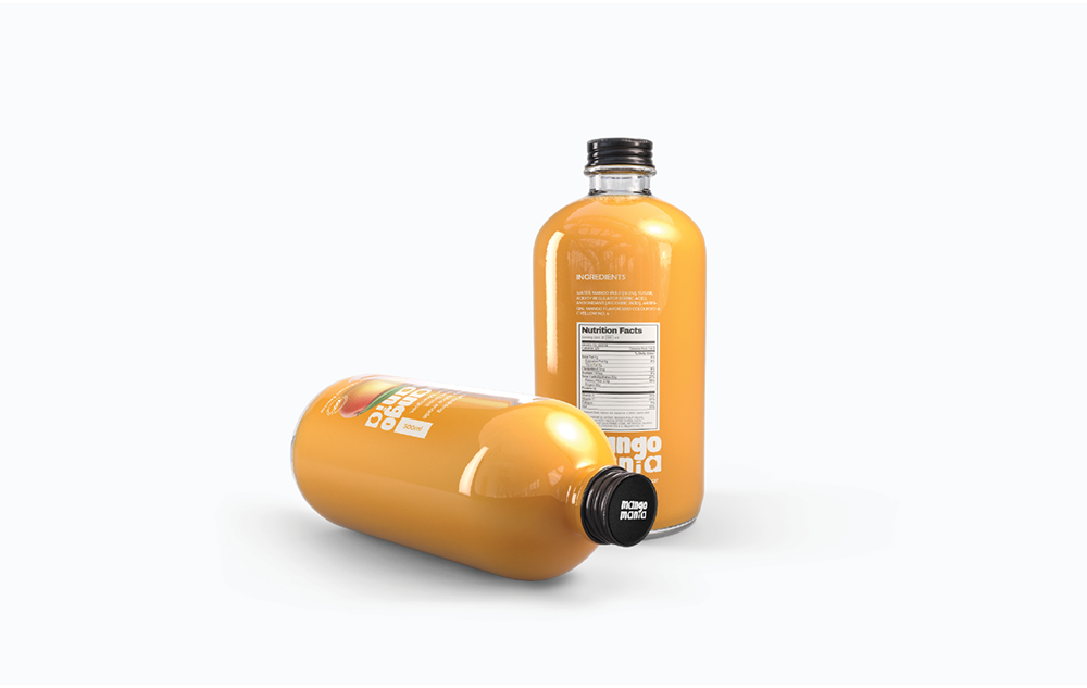
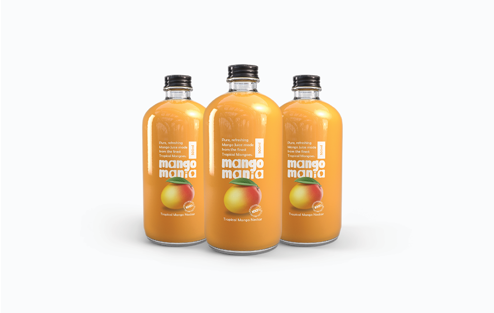
Furthermore, the product label had a very specific requirement. The juice had to be visible through the label. Therefore, the design had to work with transparency in mind. It needed to look clean and professional on European retail shelves.
In addition, the name itself — Mango Mania — had to be the hero. Every element had to earn its place. Nothing could feel forced or decorative. Getting the brief right took time. We asked many questions, listened carefully, and wanted to fully understand the brand before we began.
Our Approach to This Project
We started with deep discovery. Several conversations and zoom meetings with the client helped us understand the business core, the family history, and the target market. As a result, we built a clear creative direction before drawing a single line.
We then worked closely with the brand name itself. Something special stood out immediately — the name contains three letter A’s. Therefore, we incorporated a mango into each of the three A’s. Each mango represents one of the three brothers. It is a hidden meaning — visible only to those who look closely. The client loved it immediately.
For the product label, we kept things clean and minimal. We used the brand’s signature mango yellow as the dominant colour. We designed the label to wrap the bottle without blocking the juice. Consequently, the natural amber colour of the mango juice became part of the visual experience. Moreover, the typography was bold yet playful — matching the energy of the brand name perfectly.
We explored many directions before arriving at the final concept. We presented each option with clear reasoning and explained the thinking behind every choice. This approach helped the client feel confident and involved throughout the process.
The Power of Negative Space in Logo Design
One of the most important decisions in this project was the use of negative space. Specifically, negative space is the empty area around and between the main design elements. When used well, it creates a hidden layer of meaning and rewards the viewer who looks closely.
In the Mango Mania logo, the negative space is where the story lives. At first glance, you see the brand name in a bold, playful typeface. However, looking closer at each letter A reveals a mango shape hidden inside. Rather than drawing the mangoes on top of the letters, we carved them out from within.
This technique is well known in logo design history. For example, the FedEx logo uses negative space to hide an arrow between the E and the X. Similarly, the WWF panda is built almost entirely from negative space. These logos are memorable because they reward attention and give the viewer something to discover.
For Mango Mania, the hidden mangoes carried an even deeper meaning. Each one represents one of the three brothers. Therefore, the logo carries a family story within its very letterforms. It is subtle, elegant, and completely intentional.
The Outcome
We delivered both the logo and product label within the agreed timeframe, and the brand identity felt premium, warm, and export-ready.
The hidden meaning — three mangoes for three brothers — gave the brand a story worth telling. Moreover, the transparent label achieved exactly what the client wanted. The juice shines through, and the product looks stunning on the bottle.
Thoughtful design like this carries real meaning while staying visually refined — because great design is never just about aesthetics. It goes deeper than that. Meaning, purpose, and connection drive every decision. The colour, the typography, and the hidden symbol all worked together to tell one cohesive story.
Working with Mango Mania reminded us why we love what we do. It was a project full of heart, and the client trusted us completely. In return, we gave them a brand identity they could be proud of — one that would represent their family story on shelves across Europe.
To see more of our work, visit our Graphic Design Portfolio. For inspiration on how the best brands use negative space and storytelling, BP&O is one of the finest references in the industry.
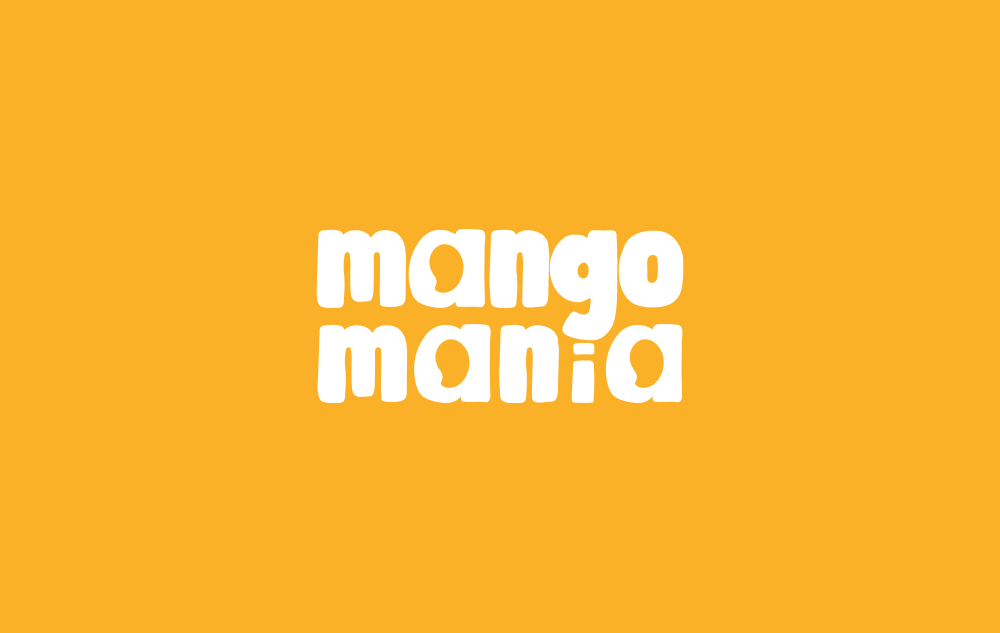
Mango Mania logo on brand yellow — logo design by Das Design Studio