Swanpond — Eco Resort Logo Design for A Luxury Nature Retreat
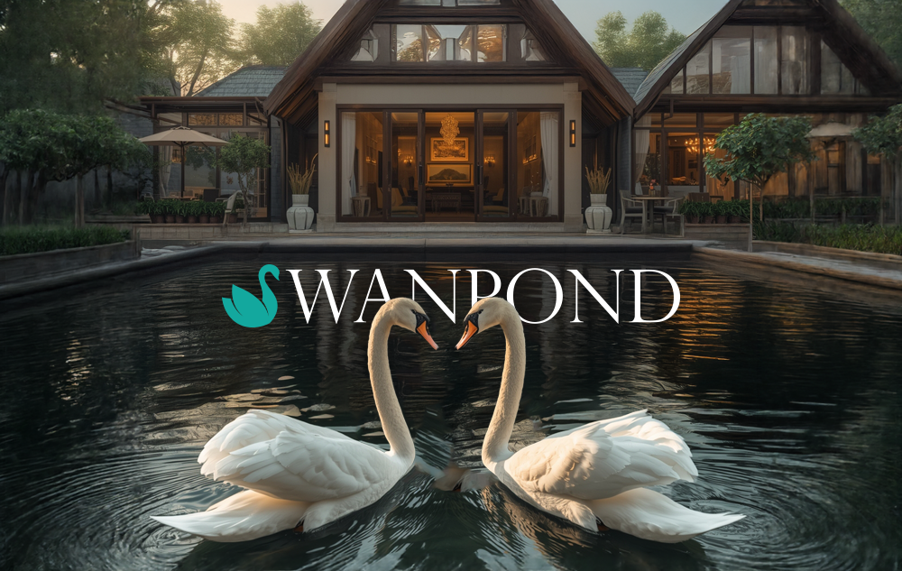
This eco resort logo design project started with something truly unique. Swanpond is a luxury retreat with a real swan pond sitting right at its entrance. Free swans live there naturally. So when the client came to us needing a logo, the story was already written in front of us. Our job was simply to translate it into a mark.
The Brief
The client needed a logo that felt premium and calm at the same time. Furthermore, it had to reflect the natural environment honestly — not just use nature as decoration. The swan pond is not a feature. It is the soul of the resort. Therefore, every design decision had to earn its place and connect back to that central idea.
The Logo Concept
First, we looked at the letter S and the shape of a swan together. The two forms share a natural curve. So instead of placing a swan next to the brand name, we merged them. The S in Swanpond becomes the swan itself — a minimal mark built from a single fluid form that suggests both the letter and the bird at the same time.
As a result, the logo works on two levels. At a glance, it reads as a clean wordmark. Look closer, and the swan emerges. That kind of layered meaning is what separates a thoughtful logo from a decorative one.
The Swan Mark
We kept the icon minimal and organic. The teal colour references calm water and eco-conscious values. Moreover, the fluid lines echo the natural movement of a swan gliding across a still pond.
The Serif Wordmark
We chose a refined serif typeface to bring out the premium, timeless character of the resort. Serif type carries a sense of heritage and confidence. In addition, it balances the softness of the icon with a grounded, authoritative presence.
Colour
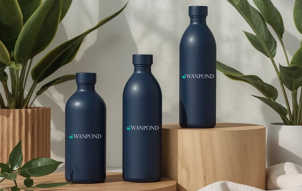
The teal and white palette is clean and natural. It works equally well on dark backgrounds, on branded linen, on signage, and on digital touchpoints. Because the logo needed to live across many surfaces, we built flexibility into the system from the start.
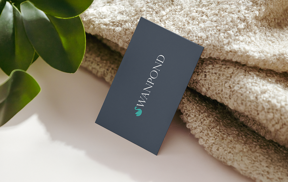
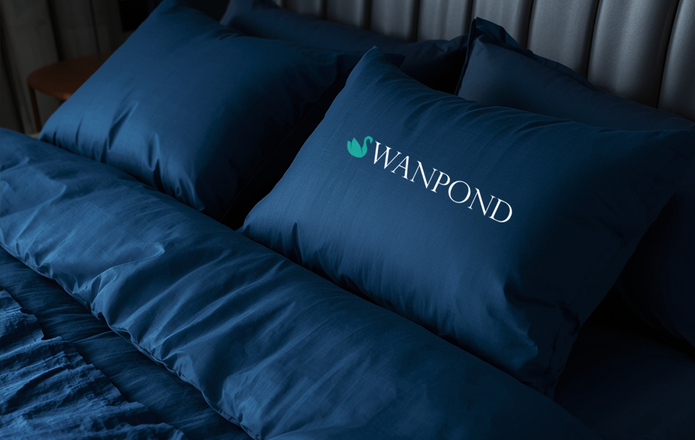
Applied across Brand Touchpoints
The logo translates beautifully to physical applications. On premium navy bedlinen, the teal swan mark and white wordmark feel quiet and luxurious — exactly the kind of understated confidence a high-end retreat needs. Similarly, against a moody resort backdrop with real swans in the foreground, the logo holds its own without competing for attention.
That is the test of a well-designed logo. It does not shout. Instead, it belongs.
What We Delivered
In summary, this eco resort logo design covered the full wordmark system — swan icon, serif typeface, colour palette, and brand application across light and dark backgrounds. Everything was built to reflect the peaceful, nature-inspired luxury that defines Swanpond.
View Our Other Logo and Brand Identity Projects here to see more of how we approach design with meaning.
For further reading on nature-inspired brand identity, BP&O is one of the best references in the industry.