Cryptoryx — Crypto Logo Design for An International Trading Platform
This crypto logo design project came with a tight deadline and a clear direction. An international crypto trading client needed a strong, futuristic logo — and they needed it within 24 hours. So we got straight to work.
The Brief
The client ran a crypto trading platform called Cryptoryx. Furthermore, the name itself already carried energy — sharp, technical, and modern. They needed a logo that matched that feeling. It had to look futuristic, bold, and credible in the crypto space. Moreover, it had to be ready fast. A 24-hour turnaround left no room for hesitation.
The Logo Concept
First, we focused on the icon. The letter C became the foundation. However, instead of a simple rounded C, we built it from angular, cut geometry — sharp chamfered corners that reference technology, precision, and forward momentum. The result is a mark that feels like it belongs in the world of blockchain and digital finance.
In addition, the negative space inside the C adds depth without adding complexity. It gives the icon a layered quality that rewards closer attention — exactly what a credible financial brand needs.
The Icon
Angular and structural, built from hard geometric cuts. It reads as a C instantly. At the same time, it carries the visual language of tech and crypto — precise, confident, and built for the future.
The Wordmark
We paired the icon with a clean, modern sans-serif in lowercase. The soft rounded terminals of “cryptoryx” balance the sharpness of the icon. As a result, the full logo feels bold but approachable — not cold or intimidating.
The Tagline
“Powering the future of crypto” sits beneath the wordmark in spaced capitals, adding authority and context without overpowering the mark.
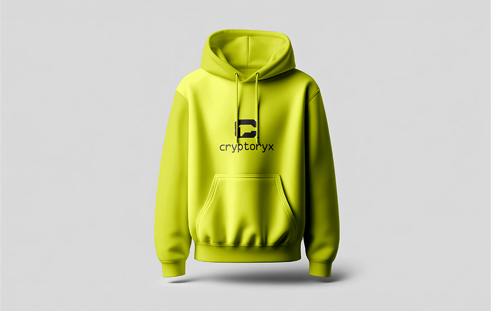
Colour
The electric yellow-green communicates energy, disruption, and innovation. It is distinctive in a market dominated by black, white, and blue. Therefore, Cryptoryx stands out immediately against competitor brands in the crypto space.
Delivered in 24 hours
Speed without compromise is one of our core strengths at Das Design Studio. This project proves that a tight deadline does not mean cutting corners. Because we work with a clear process — brief, concept, refinement, delivery — we can move fast and still produce work that holds up long term.
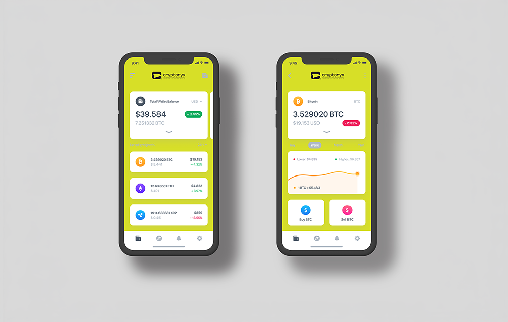
What We Delivered
In summary, this crypto logo design covered the full mark — geometric C icon, wordmark, tagline, and colour system — all delivered and ready to use within 24 hours of the brief.
View Our other Logo and Brand Identity Projects here to see more of how we work.
For further reading on logo design in the fintech and crypto space, BP&O is one of the best references in the industry.