Revocare Solutions — BPO Company Logo Design and Complete Rebrand
This BPO company logo design project was about giving an established business a completely new face. Revocare Solutions is a Sri Lanka-based digital solutions company operating across software, marketing, and contact centre services. They already had a logo. However, they needed a total rebrand — something that reflected where the business was going, not where it had been.
The Brief
Managing Director Sharon Dharshan contacted us directly and explained the full picture. Revocare Solutions had grown into a multi-vertical BPO and digital solutions company. Furthermore, their existing identity no longer matched the scale or ambition of the business. So they needed something creative but minimal — a mark that felt professional, modern, and credible at enterprise level.
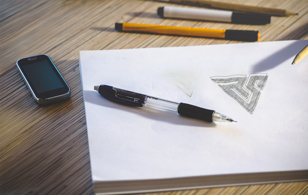
We asked a lot of questions first. We listened carefully. Because getting the brief right at the start saves everyone time later.
The Logo Concept
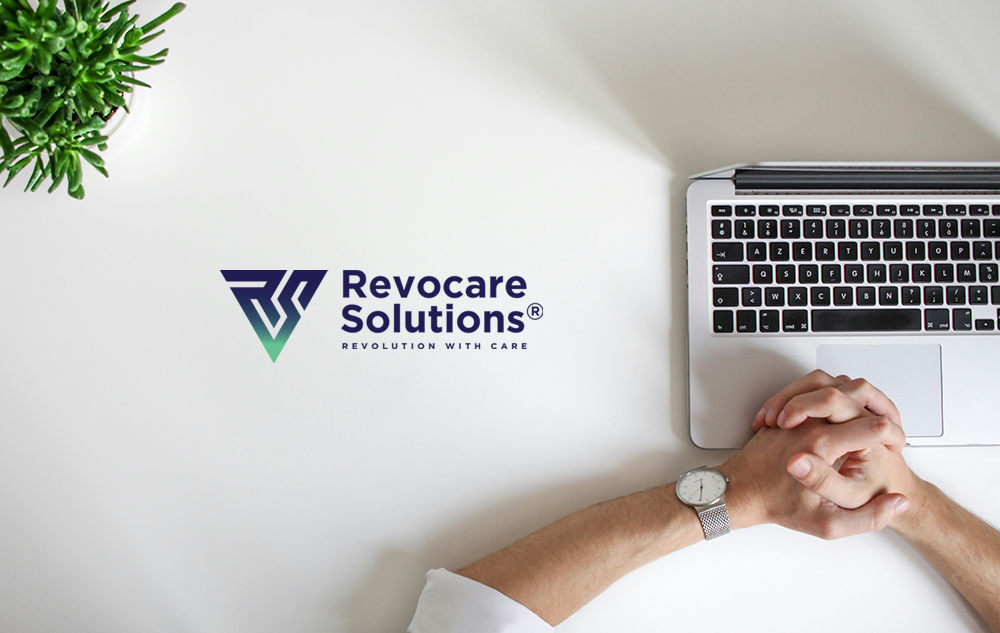
First, we built the icon around the letters R and S — the initials of Revocare Solutions. However, instead of a straightforward monogram, we constructed it from a downward-pointing triangle form. The triangle carries strong visual associations with direction, precision, and forward momentum. Moreover, the R and S are woven into the geometry so the mark reads as both an abstract shape and a letterform simultaneously.
As a result, the icon works at any size. It holds its structure on a business card, on a building sign, and on a screen. That scalability is essential for a company operating at the level Revocare Solutions does.
The Gradient Conversation
The client requested a blue and green gradient as their brand colour. We advised them honestly on the risks. Gradients can be difficult to reproduce consistently across print, embroidery, and single-colour applications. Therefore, we presented the case for a flat colour alternative as well.
However, Sharon and the team were clear — the gradient was their choice. So we made it work as well as it possibly could. We built the gradient with precision, tested it across all the brand applications, and ensured it translated cleanly from screen to print. Sometimes the best thing a designer can do is execute the client’s vision with full commitment and craft.
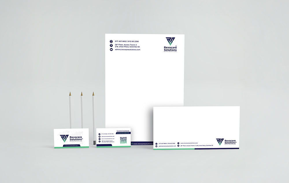
Stationery and Brand Application
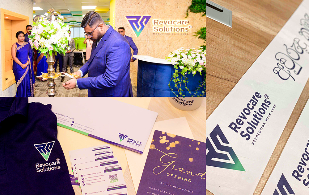
In addition to the logo, we designed the full stationery suite — letterhead, business cards, and envelope — all applied consistently with the gradient mark and wordmark. The result is a professional, cohesive identity that holds up across every client-facing touchpoint.
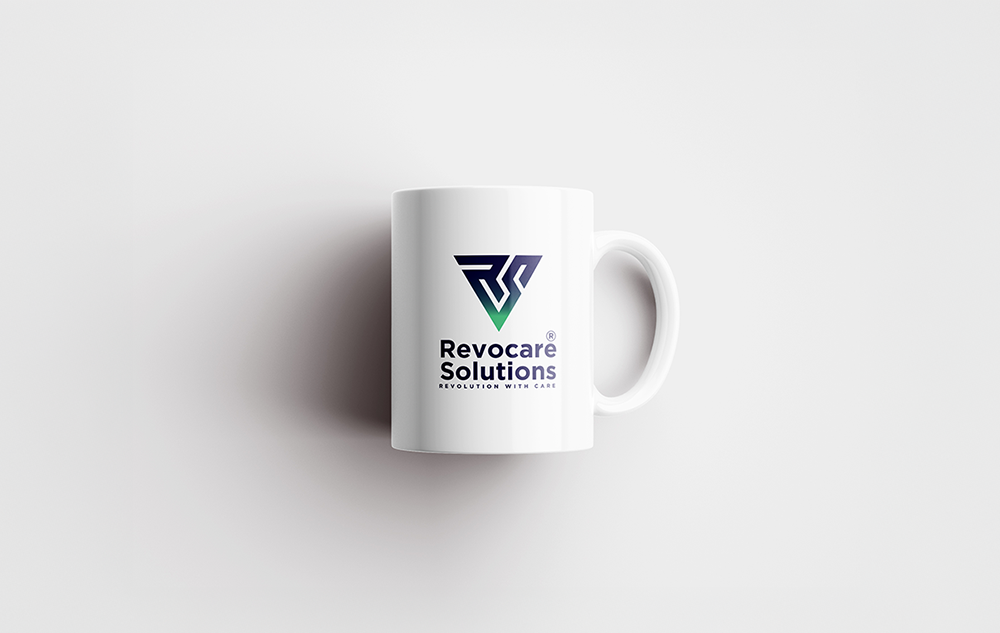
We also applied the logo to branded merchandise, demonstrating how the mark scales and adapts across physical applications without losing impact.
What The Client Said
Sharon Dharshan, Managing Director of Revocare Solutions, shared this after the project was completed:
“I’m truly impressed with how Das Design Studio handled our rebranding. They took the time to understand exactly what we wanted and didn’t stop until we were fully satisfied… “
You can read the full review on our About page.
What We Delivered
In summary, this BPO company logo design project covered the complete identity — geometric RS icon, gradient wordmark, tagline “Revolution with Care”, full stationery suite, and brand application across print and merchandise. Everything built to represent a business that means business.
View Our Other Logo and Brand Identity Projects here to see more of how we approach rebranding from brief to final delivery.
For further reading on brand identity for service businesses, BP&O is one of the best references in the industry.