The Challenge
In the fast-growing food delivery space, Chat N Eat wanted to carve out a niche by adding a social twist to the experience. Their platform allows users to chat, select meals collaboratively, and have their food delivered seamlessly to their doorsteps. But before launching, they needed a minimalist, modern logo that could clearly communicate two key ideas:
- Conversation (chat feature)
- Food (meal selection + delivery)
They approached Das Design Studio with a simple brief: “We want a clean, professional logo that feels modern, tech-savvy, and food-focused—without any clutter.” That was our cue to stir the creativity pot.
The Approach
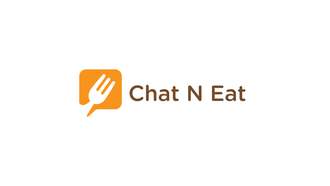
We decided to fuse two core brand functions—talking and eating—into one iconic symbol. The result? A smart, scalable, and memorable logo
- We crafted a speech bubble as the base shape—instantly symbolizing the chat functionality of the app.
- Inside the bubble, we embedded a fork, subtly but powerfully signaling the food aspect. The fork isn’t just placed on the logo—it’s part of it, forming a seamless visual metaphor: Talk food. Eat food. Repeat.
- The color palette balances warmth and modernity: a vibrant orange
evokes appetite and friendliness, while the rich brown typography adds a grounded, earthy tone—perfect for a food-focused digital brand. - The font is rounded, approachable, and tech-forward—carefully chosen to feel user-friendly on both app screens and delivery bags alike
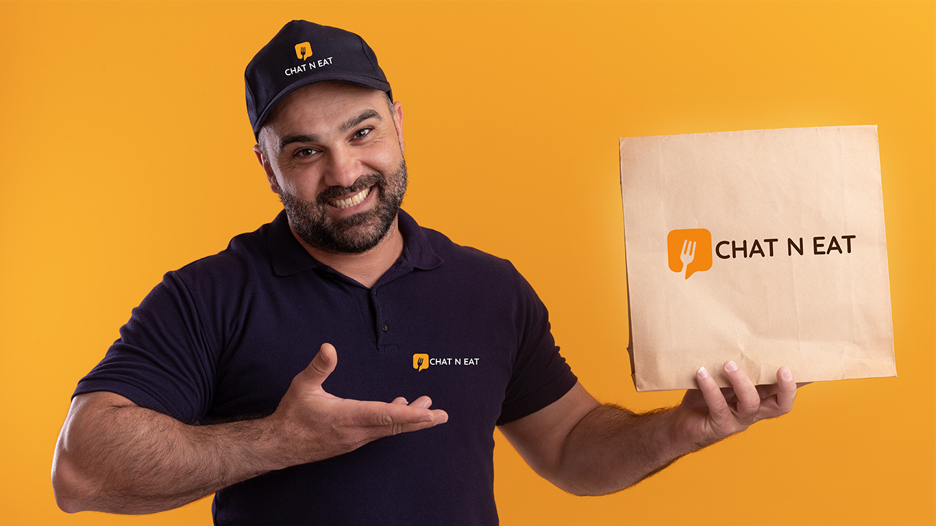
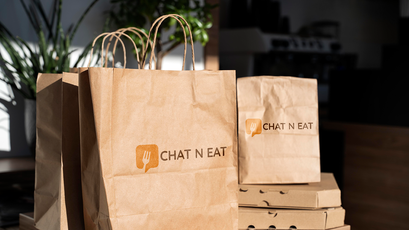
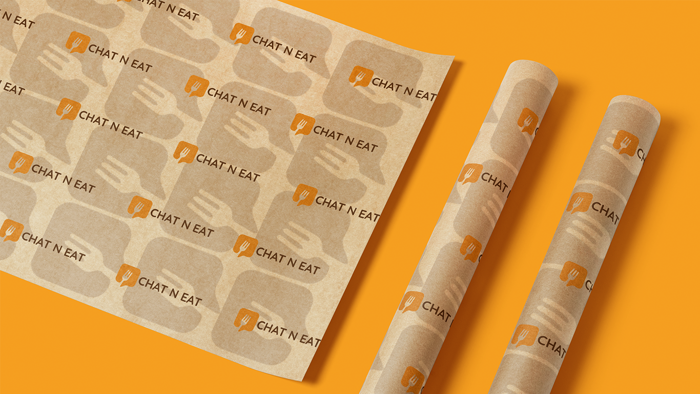
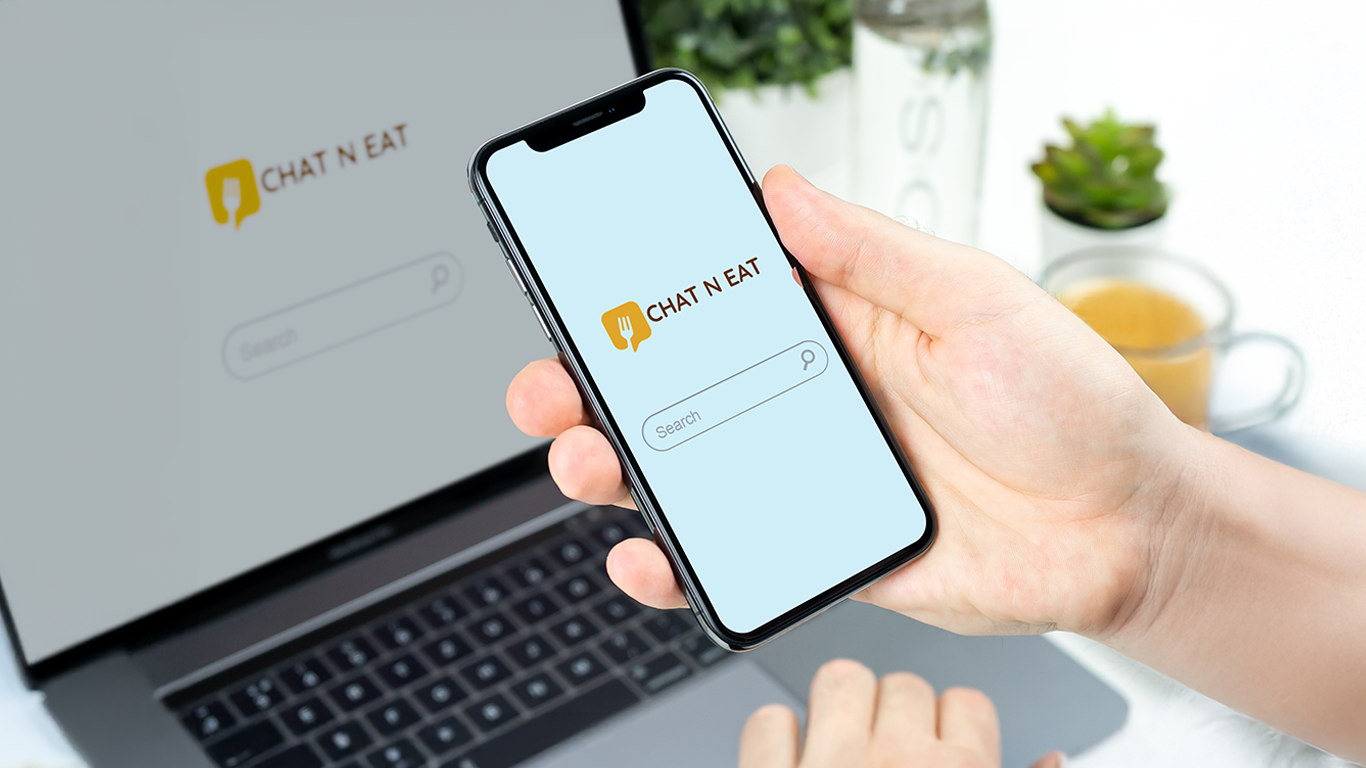
This logo wasn’t designed just to look good; it was built to work across all platforms—from digital apps and websites to packaging, icons, and social avatars.
The Outcome
The Chat N Eat logo has become a defining asset of the brand’s identity. It is:
- Visually iconic and instantly understandable, merging “chat” and “eat” in a single glance
- Highly scalable, retaining clarity from large-format banners down to app favicons
- Memorably minimalist, standing out in a crowded market without screaming for attention
- Platform-ready, designed with UI/UX consistency in mind across digital and physical touchpoints
Most importantly, the logo embodies the brand’s core promise: Food and conversation—delivered.
Another minimal masterpiece delivered by Das Design Studio, where less is always more (especially when it looks this smart).