Happy Milk — Milk Brand Logo and Label Design for an Organic Almond Milk Brand
This milk brand logo and label design project had a brief unlike any other we had taken on. Happy Milk is a 100% organic almond milk brand based in Australia. However, what makes this brand truly special is not just the product — it is the purpose behind it. The owner donates 10% of every product’s profit to a charity that saves cows from being killed for meat. Furthermore, that mission shaped every single design decision we made.
The Brief
The client came to us with three clear goals. First, the brand needed a simple, friendly logo that felt warm and approachable — not cold or corporate. Second, the packaging had to be print-cost friendly. Complex colours and heavy ink coverage add cost at scale, so everything had to work efficiently. Third, the product needed to stand out on a supermarket shelf. Among dozens of competing almond milk brands, Happy Milk had to be the one people noticed first.
In addition, the client had a specific character in mind. Because the brand is built on almond milk — not dairy — they wanted a smiling baby cow face as the mascot. The idea was to make the cow feel cute, happy, and full of life. Not a product. A friend.
The Logo
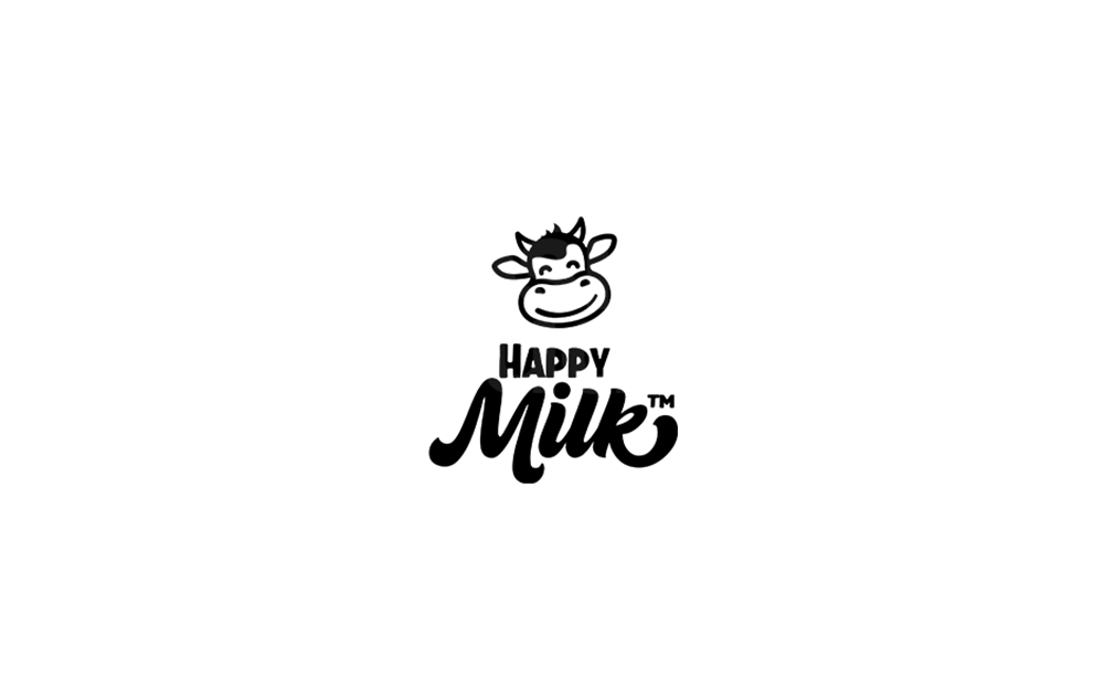
We designed a simple, bold cow face icon with a big smile and round expressive eyes. The line-work is clean and minimal, using as few strokes as possible while keeping the character full of personality. Moreover, the “Happy Milk” wordmark pairs a bold uppercase sans-serif for “HAPPY” with a flowing script for “Milk” — giving the brand a friendly, down-to-earth voice.
The result is a logo that works equally well in black and white or in colour. It scales from a small bottle label to a large outdoor sign without losing any of its charm. Because the design is so clean, print costs stay low regardless of the application.
The Label Design — and the Clever Cow Print
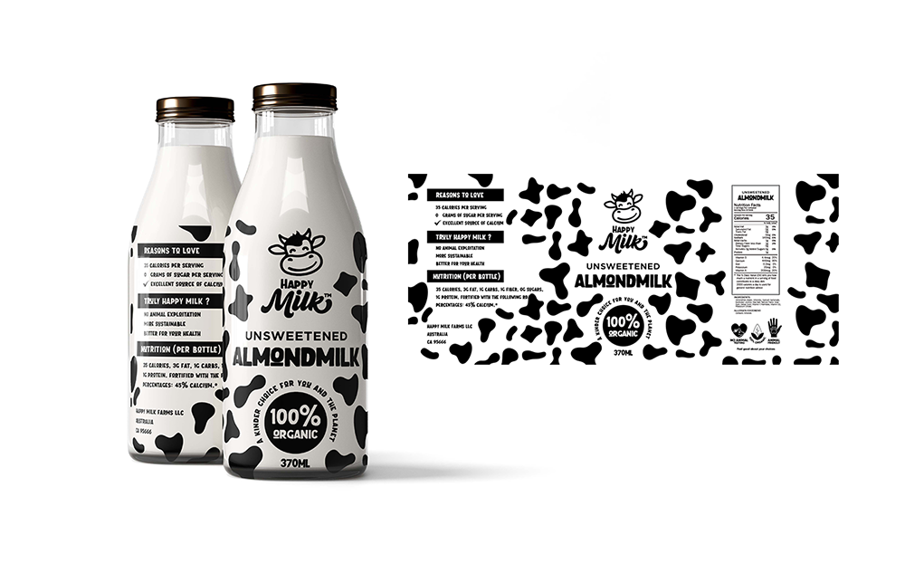
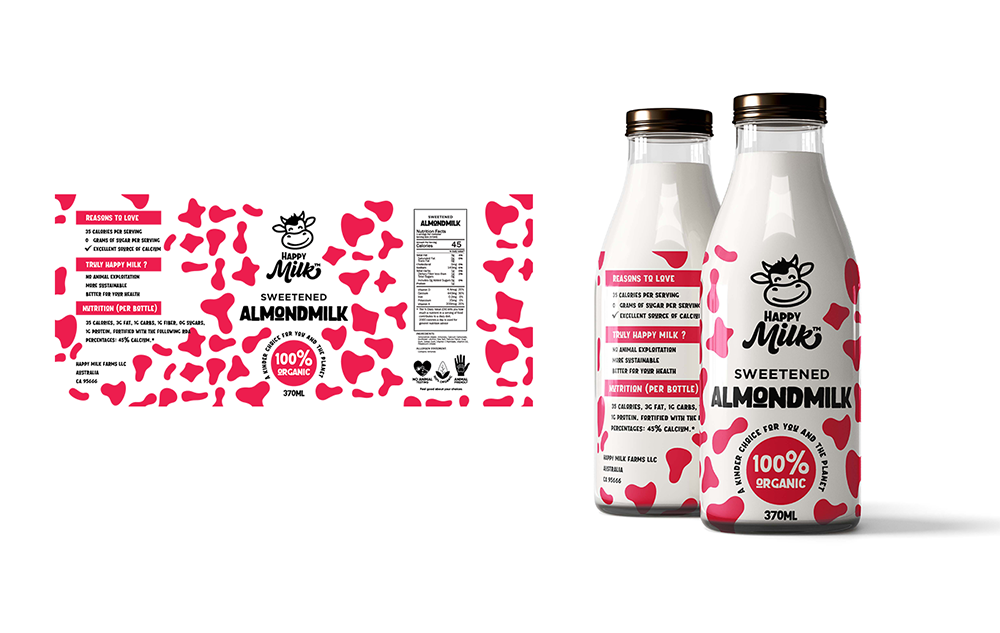
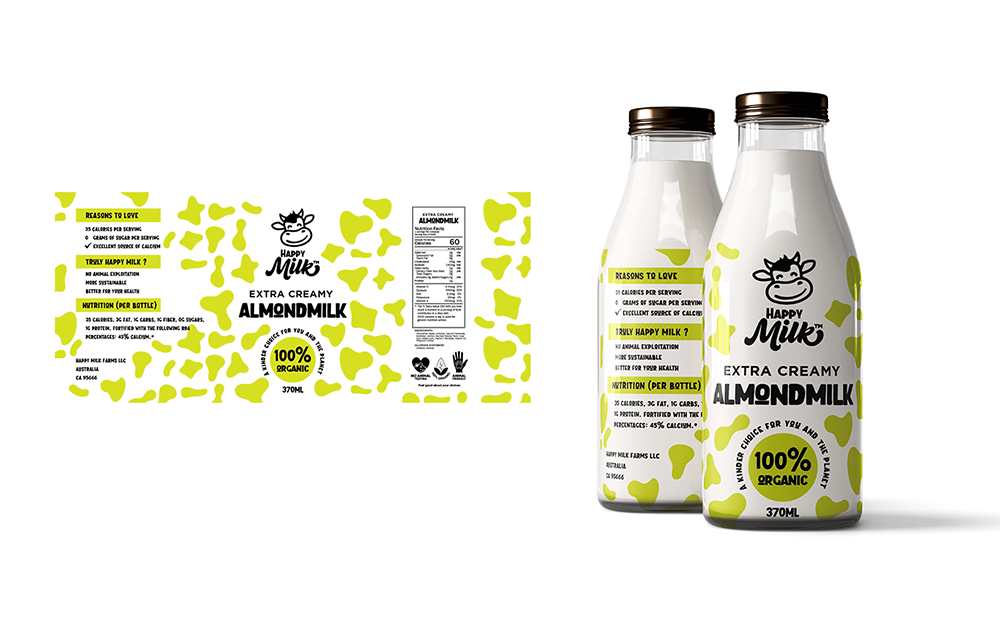
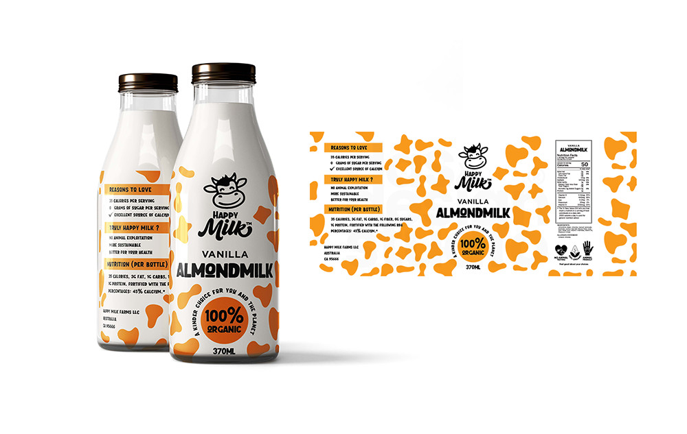
Here is where the design gets interesting. We covered the entire label in a cow print pattern — the classic black, white, and irregular spot shapes most people instantly recognise. For an almond milk brand, that is a bold and unexpected choice. Furthermore, we knew it would raise questions.
That is exactly the point. When a shopper picks up a bottle and asks “why does an almond milk brand use a cow print?” — the answer tells the brand’s whole story. Happy Milk uses the cow print as a visual reminder of the animals it is working to protect. Every bottle you buy helps save a cow’s life. The packaging does not just sell a product. Instead, it starts a conversation and builds real brand value through meaning.
The Colour System
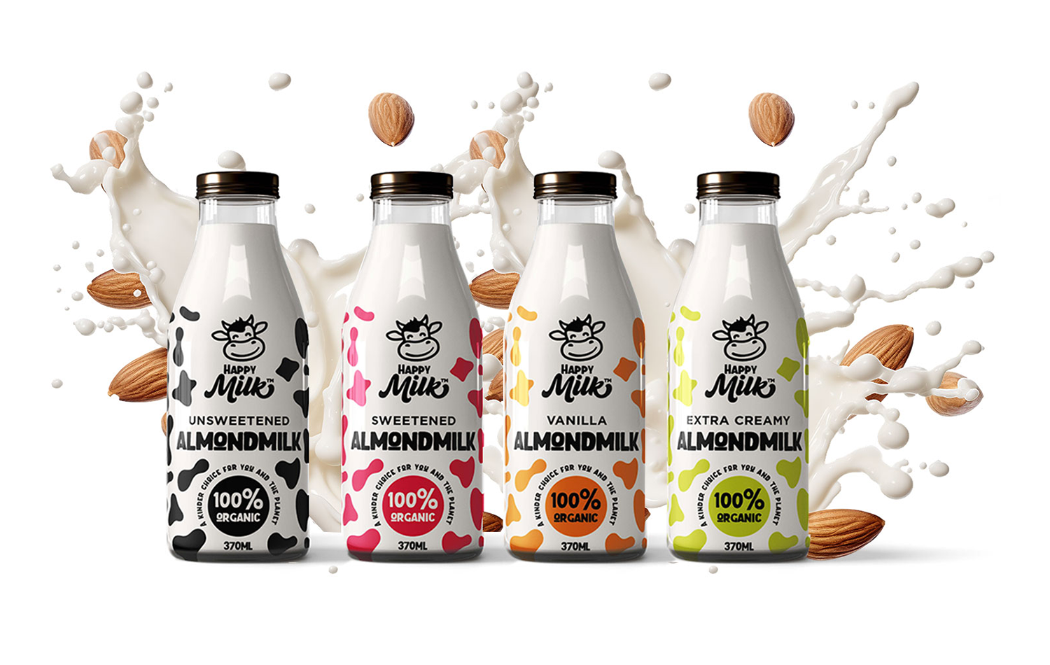
Each of the four variants gets its own colour while the black cow print stays consistent across all of them. As a result, the range reads as a clear family on the shelf while each variant is instantly distinct. The four variants are Unsweetened in black and white, Sweetened in pink and red, Vanilla in orange and gold, and Extra Creamy in lime green. Together, they create a striking lineup that is hard to miss in any supermarket aisle.
What We Delivered
In summary, this milk brand logo and label design covered the full scope — smiling cow mascot logo, cow print label system, four colour variants, full label layout with nutrition facts and brand messaging, and a design system built for both print efficiency and shelf impact.
View Our other Packaging and Brand Identity Projects here to see more of how we work.
For further reading on packaging design that tells a brand story, The Dieline is one of the best resources in the industry.