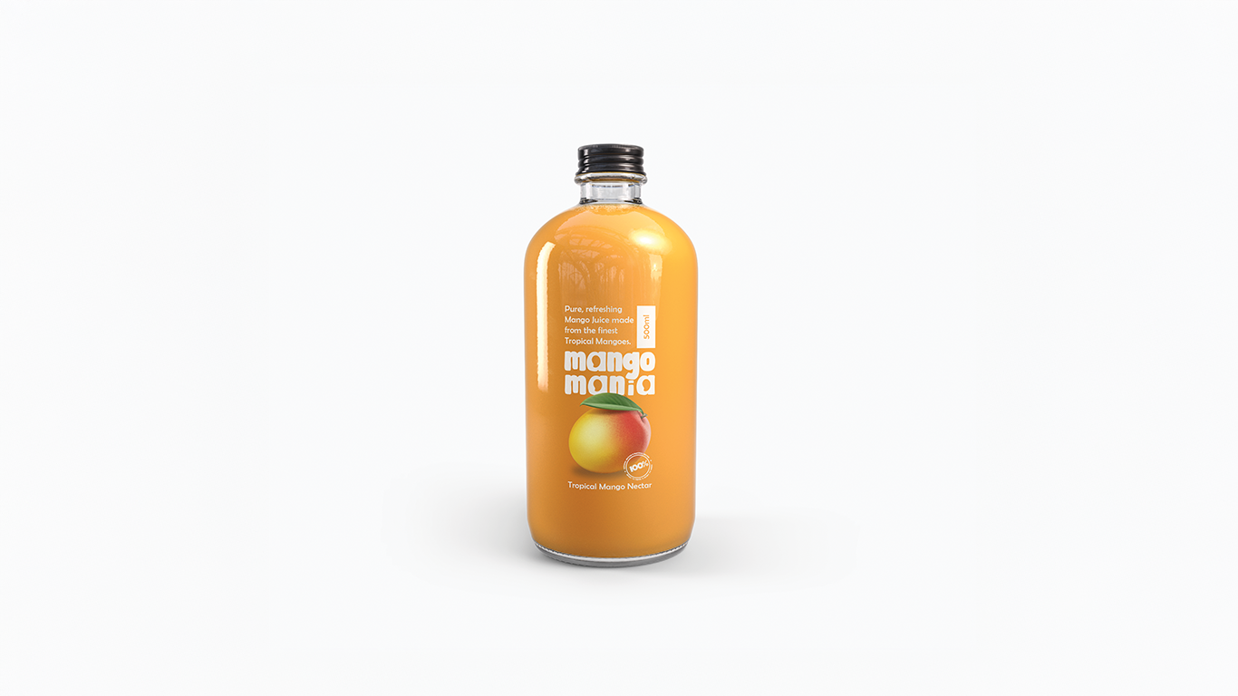
The Challenge
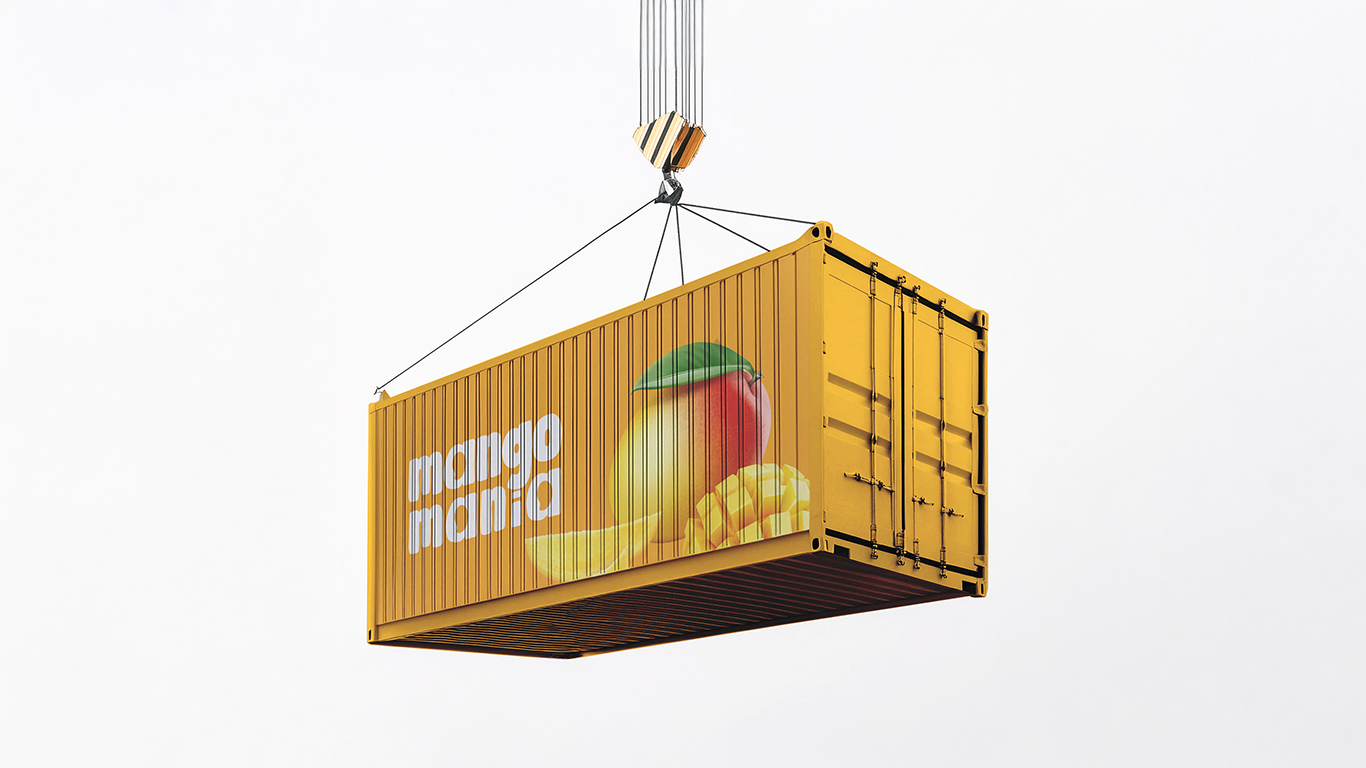
Mango Mania, a tropical mango nectar brand based in Maharashtra, India, approached us with a simple yet strategic goal — to design a minimalist logo that solely represents their brand name. The identity had to be budget-friendly for print, compatible with all types of packaging formats, and still feel playful, tropical, and fresh. No complicated icons, no intricate patterns — just pure, memorable branding that works from bottle labels to export cartons
The Approach
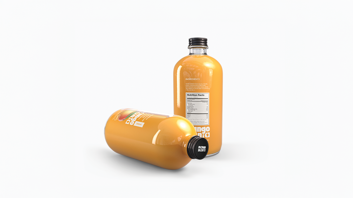
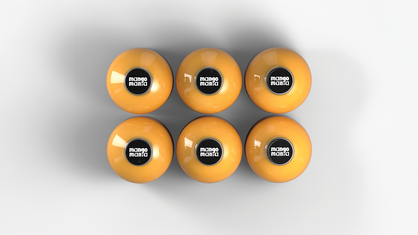
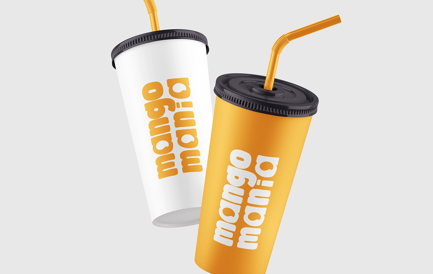
At Das Design Studio, we don’t just design — we decode the brand’s essence. We took the time to research the mango beverage industry, low-cost printing limitations, and minimalist logo trends globally. The result? A bold, approachable concept crafted using the “Be Bold” font — punchy, friendly, and eye-catching. To inject uniqueness, we replaced every “a” in the logo with a stylized mango icon, turning the brand name itself into a subtle, fruity signature. This created a clean yet clever logotype that instantly pops without relying on external graphics.
The Outcome
The client was thrilled with the concept’s clarity, uniqueness, and print efficiency. It ticked every box: visually distinctive, easy to reproduce, and brand-aligned. Following the logo’s success, we were immediately commissioned to design a series of minimalist mango nectar labels — proving that a well-designed logo opens doors to scalable brand identity.