The Challenge
Designing Mango Mania branding required a careful balance between minimal design and strong visual impact. The goal was to create a mango beverage brand that instantly communicates freshness, flavor, and excitement while remaining clean and modern.
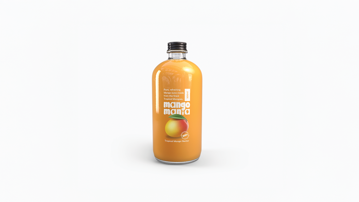
At Das Design Studio, we were approached to create the complete brand identity and packaging design for Mango Mania, a tropical mango nectar beverage. The client wanted a logo and label that would immediately give people the feeling of a sweet and refreshing mango drink at first glance.
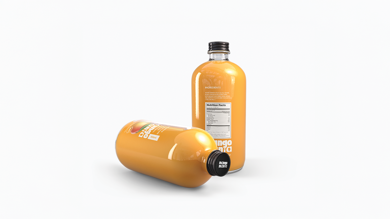
The product would be sold in transparent glass bottles, which created an interesting design challenge. The vibrant mango-colored drink would always be visible through the bottle, meaning the branding had to remain clear, readable, and visually appealing even through the liquid.
Because of this, the Mango Mania branding project became more than just a logo design. It was about creating a minimal identity system that works perfectly with the product itself, allowing the drink to become part of the visual experience.
If you are interested in similar projects, you can explore more work in our branding and packaging design portfolio.
The main challenge of the Mango Mania branding project was creating a design that felt fun, tropical, and appetizing while remaining extremely minimal.
Many beverage brands rely on heavy illustrations, bright color palettes, and complex packaging graphics to attract attention. However, the client specifically requested a clean and minimal design that still makes customers instantly think about a delicious mango drink.
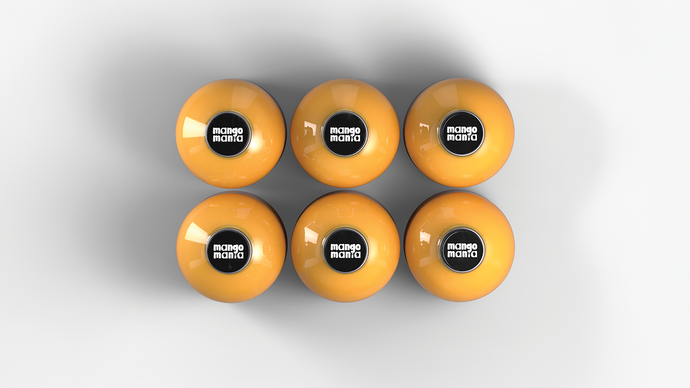
Another important factor was the transparent glass bottle packaging. Since the drink itself is visible, the logo must remain clearly readable through the yellow-orange mango nectar.
This meant the branding needed to:
• Stay highly visible through the liquid
• Maintain a fresh and tropical personality
• Avoid visual clutter on the bottle
• Feel modern and premium on store shelves
According to packaging industry insights from www.packagingstrategies.com
transparent bottles often improve product appeal because customers can see the actual beverage color and quality.
The Approach
To solve this challenge, we focused on building a strong typographic identity that could carry the personality of the brand while keeping the overall design minimal.
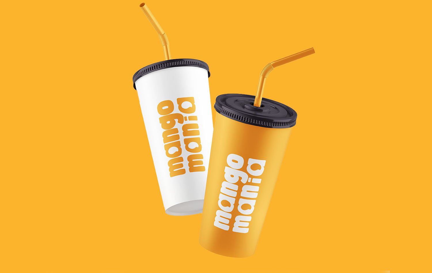
The Mango Mania wordmark was created using rounded, friendly letterforms. Soft typography naturally communicates sweetness, playfulness, and approachability, making it ideal for a fruit beverage brand.
One of the most interesting elements of the Mango Mania branding concept is hidden within the typography itself. The brand name contains three letter “A” characters, and these were subtly designed to resemble three mango shapes integrated within the lettering.
This small visual idea strengthens the connection between the brand name and the fruit while keeping the logo clean and modern.
The main concept behind Mango Mania branding was to let the drink become the hero of the packaging.
Instead of introducing multiple brand colors, we used a minimal color strategy. The logo is primarily designed in white so it remains clearly visible through the vibrant mango nectar inside the bottle.
This allows the drink’s natural yellow-orange color to become the dominant visual element of the product.
When designing the label, we maintained the same philosophy of simplicity. The label includes:
• The Mango Mania logo
• A minimal mango illustration
• Product information
• A freshness badge
All elements were carefully arranged to maintain balance while ensuring the packaging still feels clean and modern.
For businesses interested in building strong brand identities like this, you can learn more about our
logo design services here:https://dasdesignstudios.com/services/
The Outcome
The final Mango Mania branding solution successfully combines minimal design with strong visual appeal.
The transparent glass bottle showcases the vibrant mango drink, while the bold white logo remains clearly visible through the liquid. This creates a distinctive look where the product itself becomes part of the branding.
On store shelves, the bottle stands out because of its simplicity. While many beverage brands rely on complex graphics, Mango Mania attracts attention by letting the rich mango color and clean typography speak for themselves.
The playful letterforms, subtle mango-inspired typography, and minimal label design together create a brand that feels fresh, tropical, and inviting.
This project demonstrates how thoughtful branding and packaging design can transform a simple beverage into a memorable product experience.
At Das Design Studio, our mission is to help brands create powerful visual identities that connect with customers and stand out in competitive markets.
If you are planning to launch a product or refresh your brand identity, feel free to explore more work in Our Social Media.